Contrary to popular belief, we do not think design is subjective, that would be art. Attention spans are getting shorter every year and good design can help deliver your message.
Following are the three fundamental principles that majority of the apps get wrong:
1. Visual Hierarchy
Visual hierarchy is the principle of arranging elements to show their order of importance.
Users use an App/ Website with intent and should not have a hard time figuring out where to look at. The App/Website is there to deliver a message, or get a task accomplished and so the elements should be placed accordingly.
Following are some examples of variables that can be used to set the Visual Hierarchy.
Size
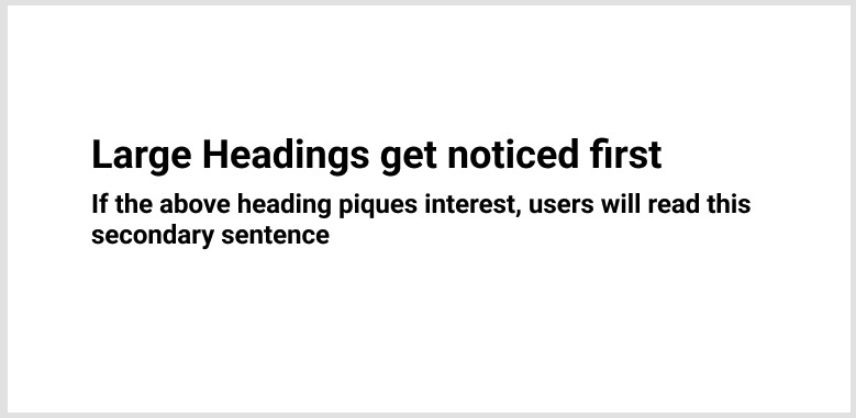
Positioning
Design helps reduce friction between the business’s goal and the user’s intent. It is the job of the business to structure its layouts to minimise users’ uncertainty. Persona exercises can be done to establish the user’s priority. Priorities can be refined further based on activity data.
Let us take an example of an online pizza store.
The goal of the business is to sell Pizza and generate profit
The intent of the user could be:
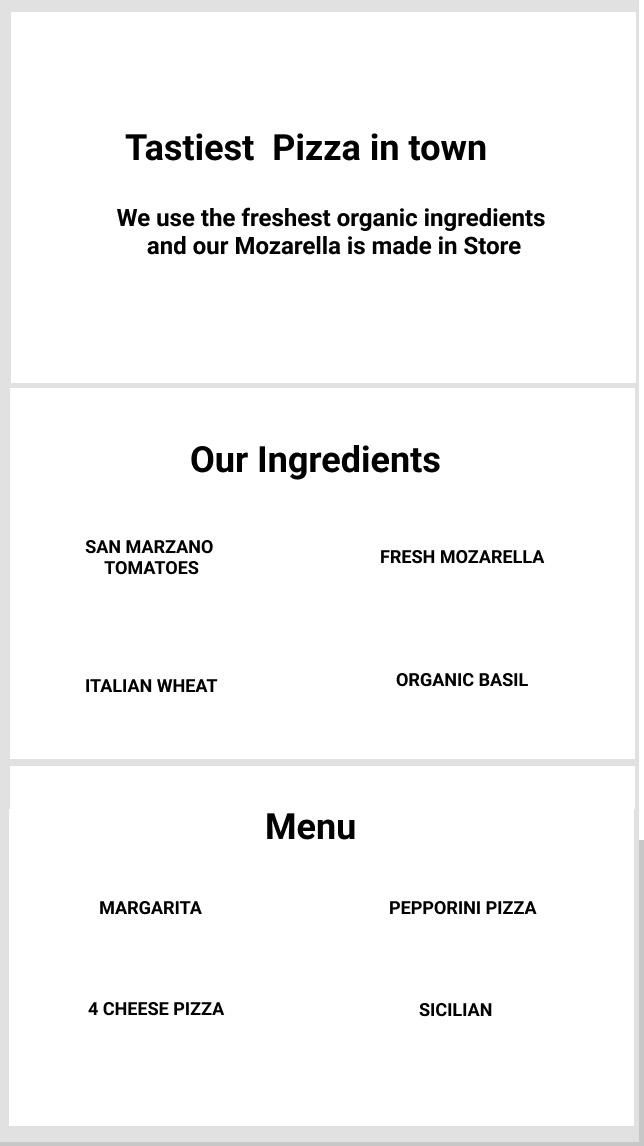
- Finding the tastiest pizza ( Gourmet Eaters )
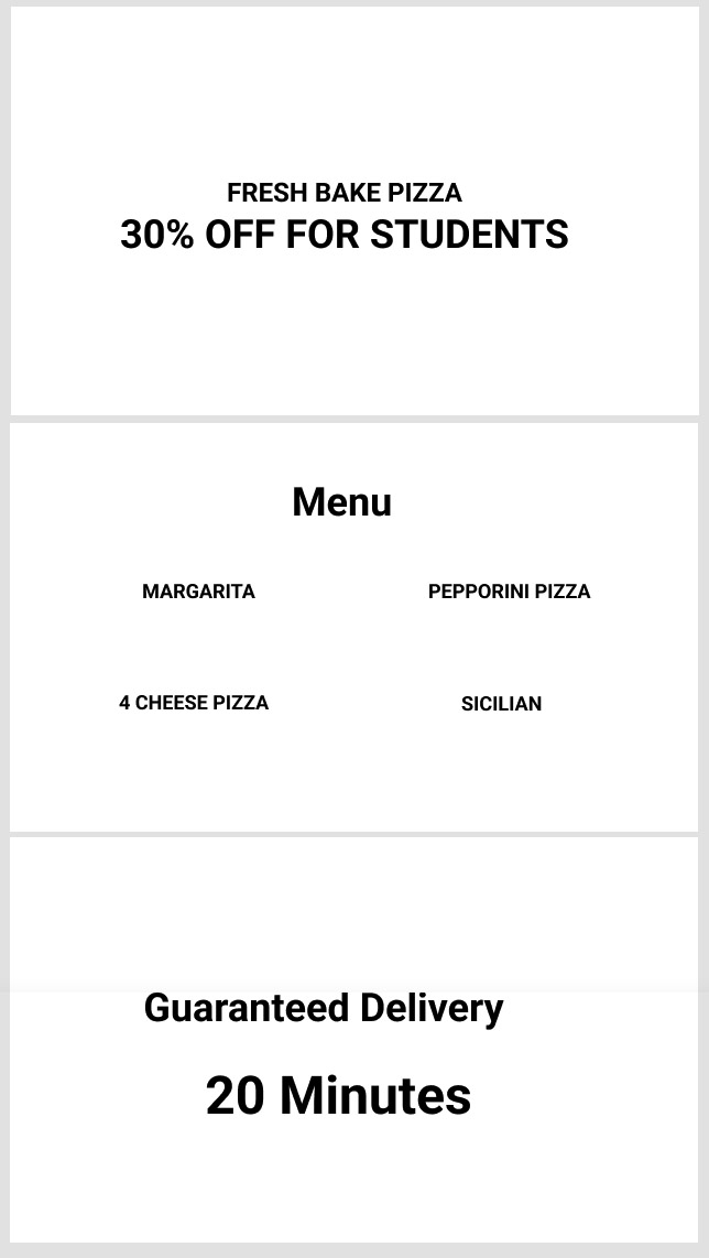
- Finding the cheapest Pizza ( Students )
The Aesthetics of the Pizza Page will change with the audience but what we are interested in is getting the message delivered in the right order. There is no point in advertising price to a user who is interested in Gourmet food and vice versa.
Positioning the items in the correct order will retain a user’s interest.
For A Gourmet Food
For B: Students
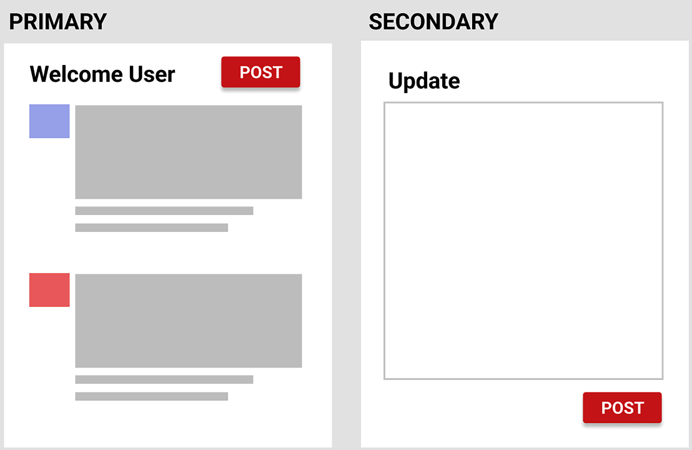
Alternatively, in the case of a multi-screen App, Primary, the most used functions stay on the main screen.
2. Visual Contrast
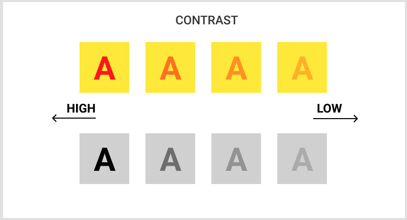
Visual contrast has to do with the readability/interpretation of elements. High contrast elements work in favor of design. This is the principle that we find is most poorly implemented in a majority of the places.
Colour
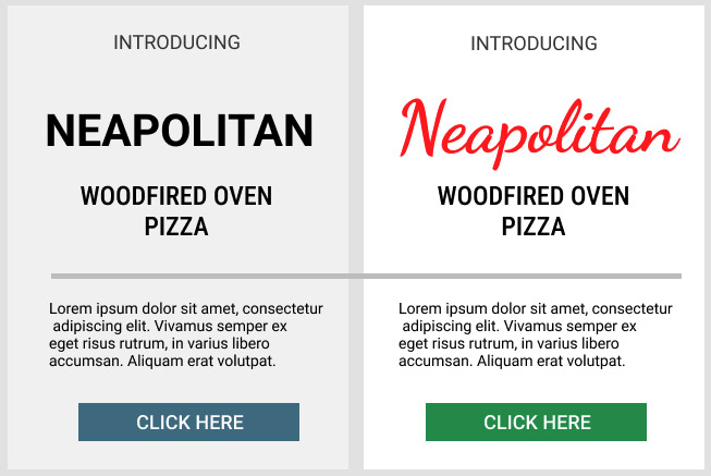
To draw a comparison for Visual Contrast, both the Banners below, follow Visual Hierarchy and are sized/positioned accordingly.
Banner B, with correct Visual Contrast, is more enhanced.
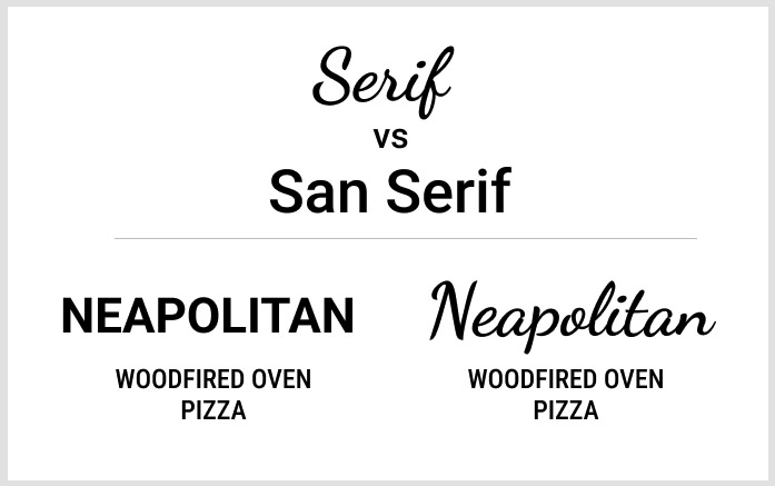
Typography
Contrasts can also be further enhanced by typography
3. Less is More
Whilst designing it is easy to get carried away and add more elements. With good design, what we are aiming for is a calm, minimalistic solution. The fewer elements that exist on the platform, the fewer choices a user has to make.
Less is more is the 10th commandment from the legendary Braun Designer, Dieter Rams

3. Less is More
Whilst designing it is easy to get carried away and add more elements. With good design, what we are aiming for is a calm, minimalistic solution. The fewer elements that exist on the platform, the fewer choices a user has to make.
Less is more is the 10th commandment from the legendary Braun Designer, Dieter Rams whose products have inspired Apple.
Good design is as little design as possible – Less is more. Simple as possible but not simpler. Good design elevates the essential functions of a product.
Simple fonts and print help people reason more clearly. The more complicated or hard-to-read the font, the harder it is for subjects to process information.
The best example of “As Little Design as Possible” is Google.
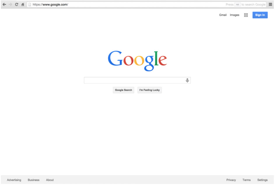
Google Home page has remained clean and simple since the beginning. Comparing that to AltaVista.com or Yahoo.com, it is pretty evident why Google has outlasted
and outgrown all its competitors.
