Rendering websites on different devices has always been a challenge.
Before responsive design was introduced,
many companies dealt with the problem of changing layout
based on screen size, especially mobile,
by creating a new website under sub-domain m i.e. m.mywebsite.com.
Later responsive design
and media queries opened up different layout solutions
based on viewport size.
Although media queries solved a lot of layout problems they are not ideal in all cases. Many websites have components that need to change their layout based on the container’s available width. We cannot achieve this solely with media queries. We are forced to write a class or target the element with a selector which looks at where it is in the document structure.
Is it not making sense? Don’t worry, let’s check out this example.
Suppose, we are developing a portfolio website. We want to keep our profile picture and a brief summary about ourselves in one component(Profile). Also, we want to render this component in the sidebar for all pages, like work experience, blog, etc. However, for the about-me page, we want to show additional details along with the Profile component, in the main area. The main area has bigger space than the sidebar. So, the Profile component should adjust according to the available space.
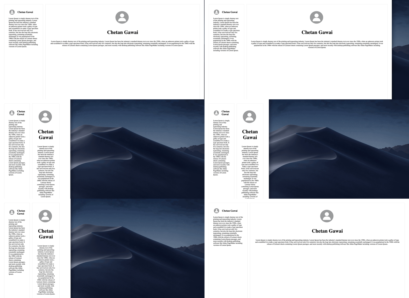
Now, the challenge is to show a smaller version of the Profile component when placed in a sidebar and, a bigger version when placed in the main content.
The first thought which comes to our mind is
to create two versions in CSS by using a class.
We add a class large to the Profile component in the main area.
  <aside>
    <div class="aboutme">
      <header>
        <img class="avatar" src="./profile_pic.png" alt="Chetan Gawai profile">
        <h1>Chetan Gawai</h1>
      </header>
      <p>Lorem Ipsum is simply dummy text of the printing and typesetting industry....</p>
    </div>
  </aside>
  <main>
    <div class="aboutme large">
      <header>
        <img class="avatar" src="./profile_pic.png" alt="Chetan Gawai profile">
        <h1>Chetan Gawai</h1>
      </header>
      <p>Lorem Ipsum is simply dummy text of the printing and typesetting industry....</p>
    </div>
  </main>
/* Default style */
.avatar {
width: 4rem;
height: 4rem;
}
.aboutme header {
display: flex;
align-items: center;
gap: 1rem;
}
h1 {
font-size: 23px;
}
/* Large style */
.large.aboutme {
text-align: center;
display: flex;
flex-direction: column;
align-items: center;
}
.large .avatar {
width: 10rem;
height: 10rem;
}
.large header {
display: block;
}
.large h1 {
font-size: 46px;
}
All good, right?
No! There is still a problem. Even after resizing, we see the larger version of the component and we want to show the larger version only when there is enough space.
How do we fix this issue?
The answer would be media queries but adding/removing a class will involve javaScript which would complicate the CSS. So we won’t go with this approach.
Let’s think of another approach.
We will target the element based on where it is placed (sidebar, main). This approach has its own problem. In some situations, we want to show the large version even on a smaller screen when there is space available. With media queries, this is not possible as they are tied to the width of the viewport.
What if the Profile component changes its style based on the width of the parent element?
This is a great idea!
We can achieve this with media queries but it will take a lot of effort.
Is there any simple solution to deal with the idea?
Yes! We have Container queries to our rescue!
What are container queries?
Container queries are the new addition to CSS which provide a new and refreshing approach to responsiveness. They specify changes to an element in relation to its parent container or element, instead of looking at the viewport size. Container queries help developers to approach responsiveness at the component level.
Syntax
The syntax of container queries is similar to that of media queries.
Container query comes with three extra properties and a rule.
container-type: Defines an element as a query container. It allows child components to query aspects of its sizing, layout, style and, state against it.
The container-type property can have the following values:
-
sizeEstablishes a query container for dimensional queries on the block and inline axis. Applies layout, style, and size containment to the element. -
inline-sizeEstablishes a query container for dimensional queries on the inline axis of the container. Applies layout, style, and inline-size containment to the element. -
normalThe element is not a query container for any dimensional queries on the block and inline axis.
-
container-name: Sets a name to the query container for filtering. -
container: A shorthand property to set bothcontainer-typeandcontainer-name.
To target the container, we use @container to specify the rule to target the nearest containment context.
Using container queries
Let’s modify our code to use container queries.
  <aside>
    <div class="main-wrapper">
      <div class="aboutme">
        ...
      </div>
    </div>
  </aside>
  <main>
    <div class="main-wrapper">
      <div class="aboutme">
        ...
      </div>
    </div>
  </main>
/* Default style */
  .main-wrapper {
    container-type: inline-size;
  }
.avatar {
width: 4rem;
height: 4rem;
}
.aboutme header {
display: flex;
align-items: center;
gap: 1rem;
}
h1 {
font-size: 23px;
}
/* Large style */
@container (min-width: 800px) {
.aboutme {
text-align: center;
display: flex;
flex-direction: column;
align-items: center;
}
.avatar {
width: 10rem;
height: 10rem;
}
header {
display: block;
}
h1 {
font-size: 46px;
}
}We wrap the div with class name aboutme present in aside and main
by a container with the class main-wrapper
and remove the large class from the main area.
With the following CSS, the browser knows we might want to query this container later.
It creates a container with containment on the inline axis only. The content can grow to as large as it needs to be on the block axis.
.main-wrapper {
container-type: inline-size;
}A container query is created using @container.
This will query the nearest containment context.
The below code shows the larger Profile component when the main content is wider than 800px.
  @container (min-width: 800px) {
    ....
  }
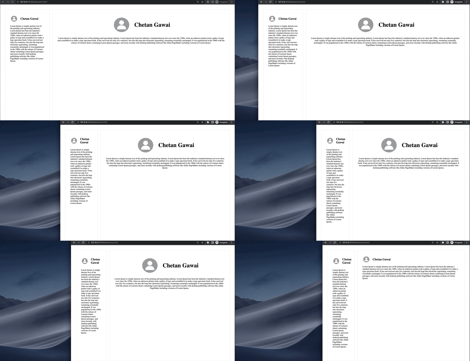
Awesome! This is what we wanted. We can use this same component in different places and it will behave as per the parent component width.
Browser support
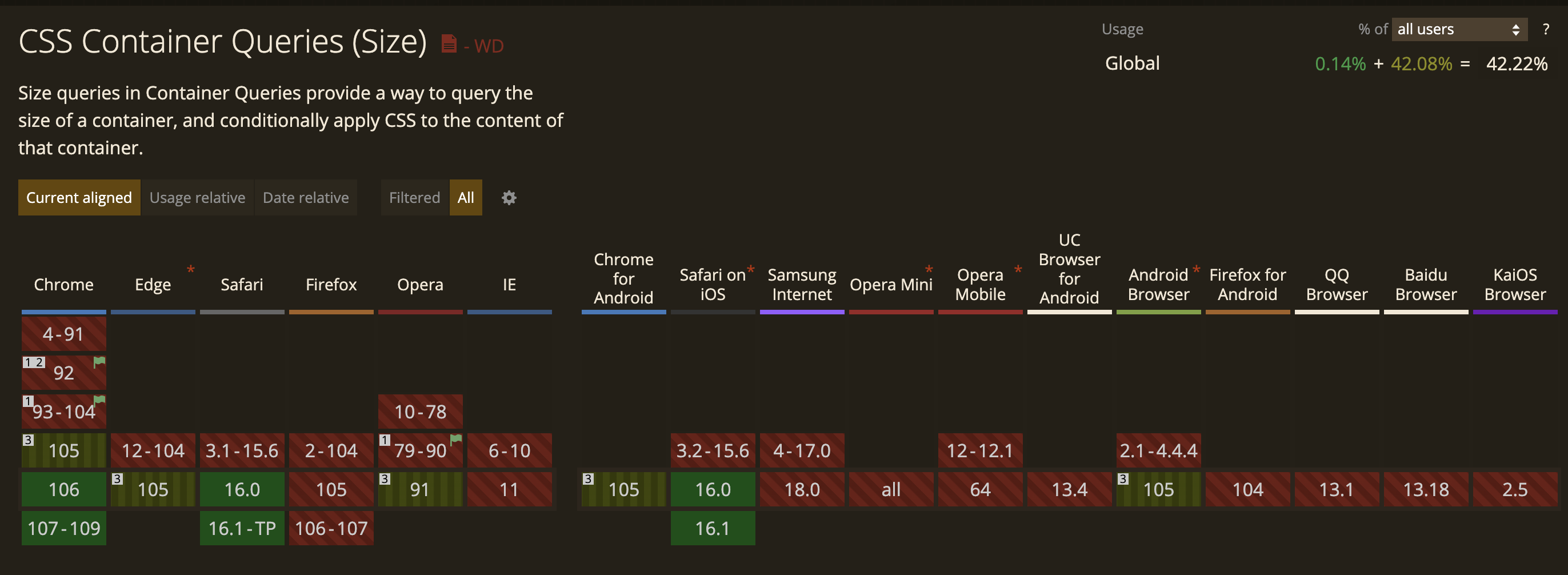
Container queries are now supported in Chrome 105, and soon in Safari 16.
 Credits: CanIUse
Hope this article was helpful.
Happy Coding!
