Choosing the right CSS framework can significantly impact our project’s design and development. Two of the most popular options are Tailwind CSS and Bootstrap, each offering a distinct approach to styling and layout. But how do we choose between them?
Let’s look into a comprehensive comparison.
Customization and Flexibility:
Tailwind: Tailwind’s utility-first approach offers unparalleled flexibility. We can build any design imaginable with low-level classes for typography, spacing, colors, and more. For instance, creating a custom button could look like this:
<button class="bg-blue-500 text-white font-bold p-4">
    Custom Button
</button>
Bootstrap: Bootstrap offers pre-built components with limited customization options. Although convenient, it can restrict creative freedom.In the given example, the utilization of the btn-primary class may lead to a generic design.
<button type="button" class="btn btn-primary">
    Custom Button
</button>
Styling:
Tailwind: Provides utilities for every conceivable styling need, allowing for pixel-perfect control over our website’s appearance.
<button class="bg-blue-500 hover:bg-blue-700 text-white font-bold py-2 px-4 rounded">
    Custom Button
</button>
Bootstrap: Bootstrap, in contrast, opts for a component-based approach.It offers predefined styles, and customizing them requires overriding existing classes or writing additional CSS.
<button type="button" class="btn btn-primary my-custom-btn">
    Custom Button
</button>
Now we can write my-custom-btn class which will override the default styles of a Bootstrap button.
.my-custom-btn {
    background-color: red;
    color: #ffffff;
}
Setup:
Tailwind: Requires minimal setup beyond installing the package and including CSS files.
1. Installation: We can install the Tailwind CSS package using our preferred package manager (npm, Yarn).
npm install tailwindcss@latest2. Configuration: Optionally, configure Tailwind’s configuration file (tailwind.config.js) to customize its behavior. This file allows adjusting features like dark mode, purging unused styles, and setting breakpoints.
// tailwind.config.js
module.exports = {
  purge: [
    './src/**/*.html',
    './src/**/*.js',
    // Add other paths to your source files for efficient purging
  ],
  darkMode: false, // or 'media' or 'class'
  theme: {
    extend: {},
  },
  variants: {
    extend: {},
  },
  plugins: [
    // Add your custom plugins here
  ],
};
3. Usage: Include the Tailwind CSS file in our HTML head section. Utilize Tailwind’s utility classes within our HTML elements to style them.
<head>
  <link href="https://unpkg.com/tailwindcss@^3/dist/tailwind.min.css" rel="stylesheet">
</head>
Bootstrap: Requires installing the package, importing JavaScript files, and potentially configuring variables.
1. Installation: Install the Bootstrap package using our preferred package manager.
npm install bootstrap@latest2. Include Files: Include the necessary Bootstrap CSS and JavaScript files in our HTML head and body sections, respectively. Bootstrap relies on JavaScript for some features like dropdown menus and modals.
3. Usage: Apply Bootstrap’s pre-built component classes to our HTML elements to utilize them. Bootstrap offers a wider range of ready-made components compared to Tailwind’s utility-based approach.
4. Customization: Modify Bootstrap’s variables, Sass or use custom CSS to override its default styles. These variables control various aspects of Bootstrap’s styles and behavior, allowing for customization without directly modifying core files.
Create a new SCSS file e.g: custom.scss where we can override Bootstrap variables.
// custom.scss

// Import Bootstrap source files
@import "../node_modules/bootstrap/scss/functions";
@import "../node_modules/bootstrap/scss/variables";


// Override Bootstrap variables
$primary: #custom_color;
$font-family-base: 'Custom Font';

// Add more variable overrides as needed
Similarly, we can write custom.css to override CSS variables.
:root {
  --bs-primary: #custom_color;
  --bs-body-bg: #custom_background_color;
}
Common Configuration Variables:
Colors: $primary, $secondary, $success, $danger, $warning, $info, $light, $dark
Spacing: $spacer, $spacers
Fonts: $font-family-base, $font-size-base
Borders: $border-width, $border-color, $border-radius
Shadows: $box-shadow-base
Grid breakpoints: $grid-breakpoints
Themes:
Tailwind: Tailwind, true to its nature, doesn’t come with predefined themes. We build our design from scratch, offering complete creative freedom. Or we can utilize community-created options.
Customizing Tailwind Themes:
To customize a Tailwind CSS theme, developers typically dig into the tailwind.config.js file. This file acts as the palette for defining colors, fonts, spacing, and other stylistic elements. Let’s take a glance at a code example snippet:
module.exports = {
  theme: {
    extend: {
      colors: {
        primary: '#3490dc', // Blue color
        secondary: '#ffed4a', // Yellow color
        customGreen: '#2ecc71', // Custom green color
      },
      fontSize: {
        'xl': '1.5rem', // Extra-large font size
        '2xl': '2rem', // Double extra-large font size
      },
      spacing: {
        '72': '18rem', // Custom spacing value
        '96': '24rem', // Another custom spacing value
      },
    },
  },
  // other Tailwind configurations...
};
Bootstrap: Bootstrap shines with a variety of themes. Applying a theme is as simple as linking to a different stylesheet, providing a quick design makeover:
To apply a Bootstrap theme, we need to include the corresponding stylesheet in the HTML file. For example:
<link rel="stylesheet" href="https://stackpath.bootstrapcdn.com/bootstrap/4.5.2/css/bootstrap.min.css">Component Library:
Tailwind: Tailwind encourages us to build our components. This approach offers freedom but might require more effort, especially for complex UI elements.
Bootstrap: Bootstrap boasts an extensive library of ready-made components like buttons, forms, cards, and more. Need a navbar? It’s as simple as:
<nav class="navbar navbar-expand-lg navbar-light bg-light">
    <!-- Navbar content goes here -->
</nav>
Learning Curve:
Tailwind: Tailwind’s learning curve is gentle. If we are familiar with HTML and CSS, adapting to its utility classes is intuitive. It Requires understanding utility classes and composing them to achieve desired styles.
Bootstrap: Bootstrap’s learning curve is slightly steeper due to its comprehensive documentation and component-based structure:
Community Support:
Tailwind: Has a growing community with extensive documentation, tutorials, and online forums.Join discussions and explore plugins on Tailwind’s GitHub.
Bootstrap: Boasts a large and established community with vast resources and active support channels. Dive into the discussions and discover more on Bootstrap’s GitHub
When to Prefer:
Tailwind: Choose Tailwind for projects requiring high customization, unique designs, no constraints or minimal code and setup.
Bootstrap: Opt for Bootstrap for rapid development, projects with existing component needs, or familiarity with its structure. It’s an excellent fit for projects requiring a polished, responsive design.
Examples:
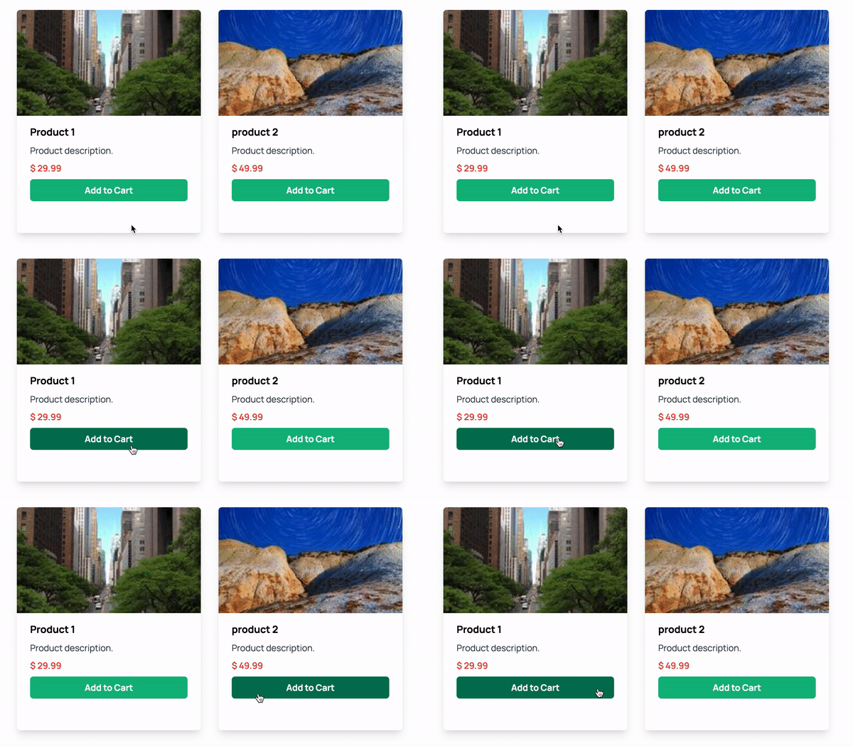
Let’s compare the example of product cards to highlight the differences in the code:
Tailwind:
<div
  className="m-4 h-2/5 w-1/4 max-w-sm overflow-hidden rounded-md shadow-lg"
  key={product.id}
>
  <img
    alt={product.title}
    className="h-48 w-full object-cover"
    src={product.image}
  />
  <div className="px-6 py-4">
    <h3 className="mb-2 text-lg font-bold">{product.title}</h3>
    <p className="mb-2 text-base text-gray-700">
      {product.description}
    </p>
    <div className=" flex flex-col">
      <span className="font-semibold text-red-500">
        $ {product.price}
      </span>
      <button className="mt-2 inline-block rounded-md bg-green-500 px-3 py-2 font-bold text-white hover:bg-green-700">
        Add to Cart
      </button>
    </div>
  </div>
</div>
Bootstrap:
<div className="card">
  <img className="card-img-top" src={product.image} alt={product.title} />
  <div className="card-body">
    <h5 className="card-title">{product.title}</h5>
    <p className="card-text">{product.description}</p>
    <a href="#" className="btn btn-primary">
      Click Me
    </a>
  </div>
</div>
Conclusion:
In the end, picking between Tailwind and Bootstrap relies on what our project truly requires and what we prefer. We should assess our priorities and opt for the framework that allows us to create our vision efficiently and flexibly.
