“Visual brand language is the unique “alphabet” of design elements – such as shape, color, materials, finish, typography, and composition – which directly and subliminally communicate a company’s values and personality through compelling imagery and design style. This “alphabet”, properly designed, results in an emotional connection between the brand and the consumer.”
Source: https://en.wikipedia.org/wiki/Visual_brand_language
How did we create our moodboard?
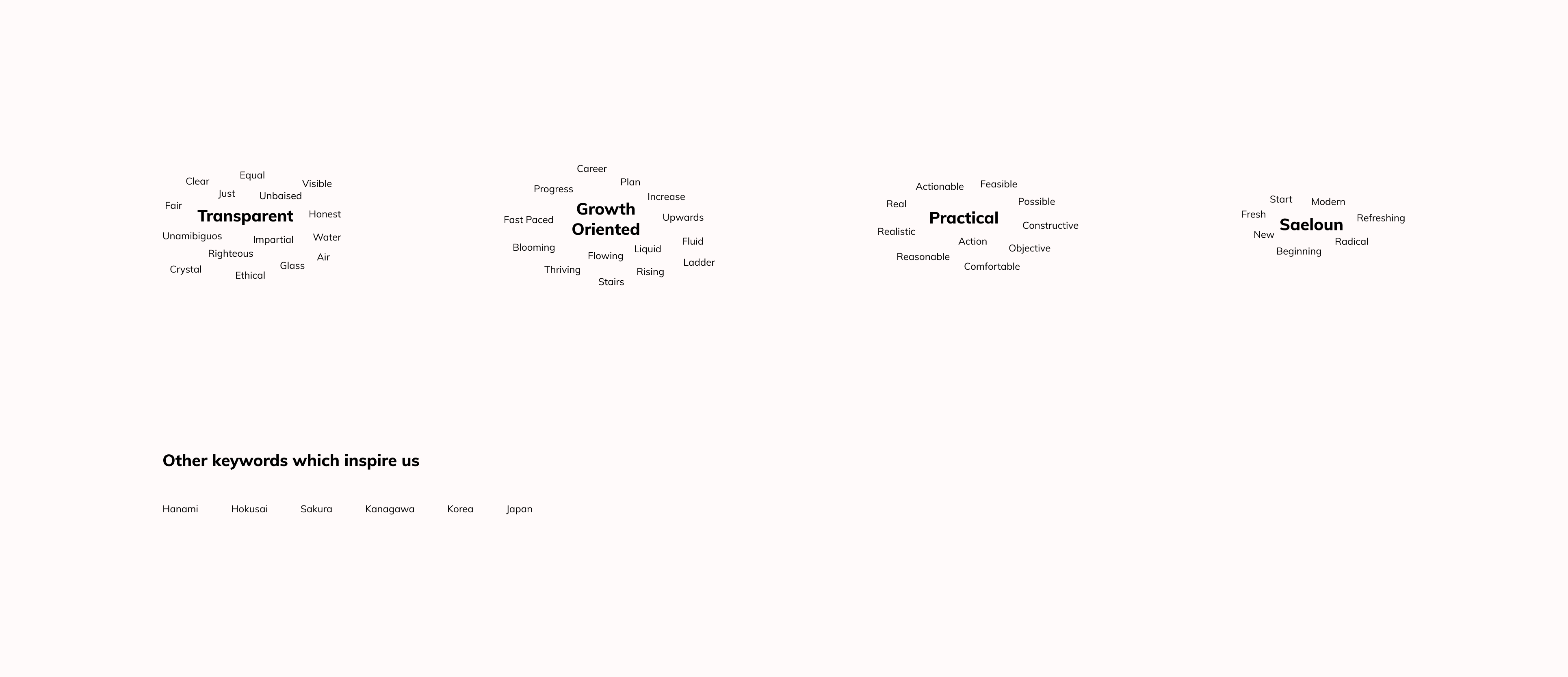
In the previous blog, I’ve discussed how we derived our values from the brand sprint exercise. Now, I will provide a detailed walkthrough of how I created our moodboard. Firstly, I took those values as keywords, and for each keyword collected words with similar meanings to form word clouds out of it.

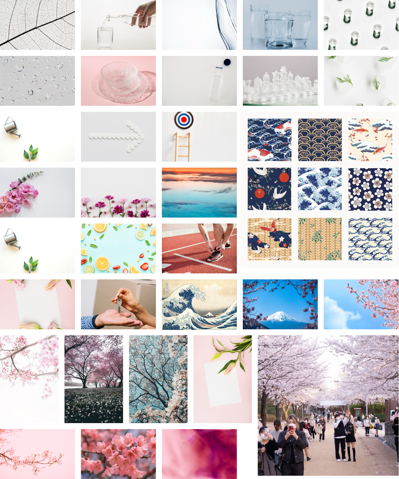
The next step was collecting images that represent these words to form a moodboard which gives a sense of emotions that we want to invoke through our brand elements.
“A mood board is a type of visual presentation or ‘collage’ consisting of images, text, and samples of objects in a composition. It can be based on a set topic or can be any material chosen at random. A mood board can be used to convey a general idea or feeling about a particular topic.”
Source: https://en.wikipedia.org/wiki/Mood_board

Final moodboard. Images credits: www.unsplash.com & https://www.rawpixel.com/image/3980762
We finalized our moodboard after a couple of iterations. There were certain reasons why we discarded previous versions which I will discuss in the next blog when we talk about the color palette. Our final moodboard was the visual representation of our values, beliefs, and everything that we are inspired from. This would serve as a reference for all future activities related to branding and redesign.
So, that’s how we arrived at our moodboard. Read further to find out how we defined our brand color palette and what those colors represent in the next blog.
