While the mood board was being created, I was simultaneously thinking about the color palette. This was an extremely challenging task for me because there are so many colors to choose from. Apart from the number of options, all these colors have different meanings to different people and could invoke multiple emotions.
What challenges did we face while creating the color palette?
I had to start somewhere so I decided to use technology to resolve the problem. There are some websites available that take an image and generate a color palette based on the colors in it.
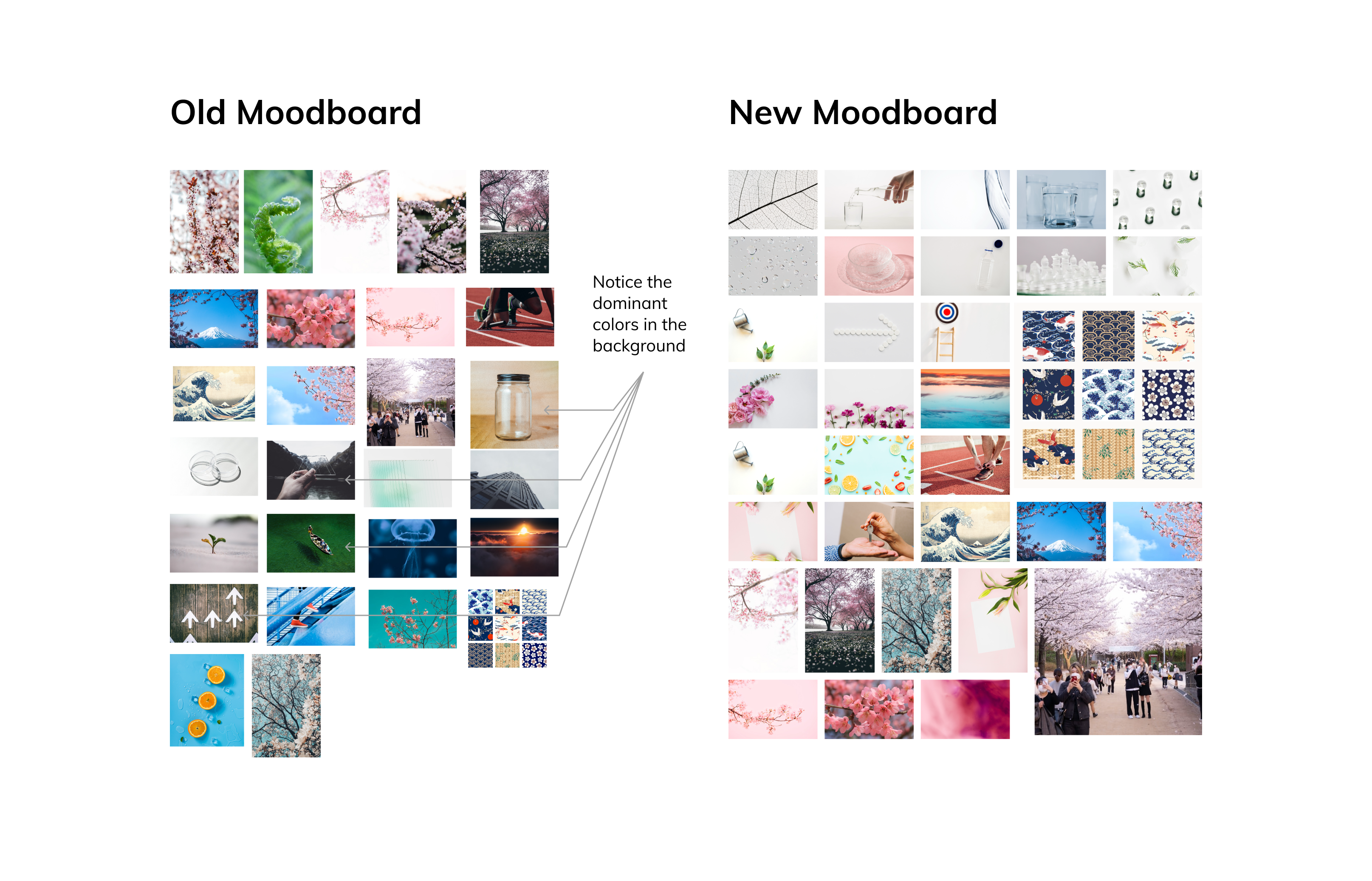
I took the initial version of our moodboard and fed it to these websites. These websites presented a good number of color palettes.
The only problem was that none of these palettes could correctly represent our brand. I realized that it was because of the images which we chose for the moodboard. Most of the chosen images had strong background colors which were impacting the color palettes. That’s when I decided to recreate the moodboard with images without any dominant background colors. With the new mood board, I could get consistent color palettes across different tools.

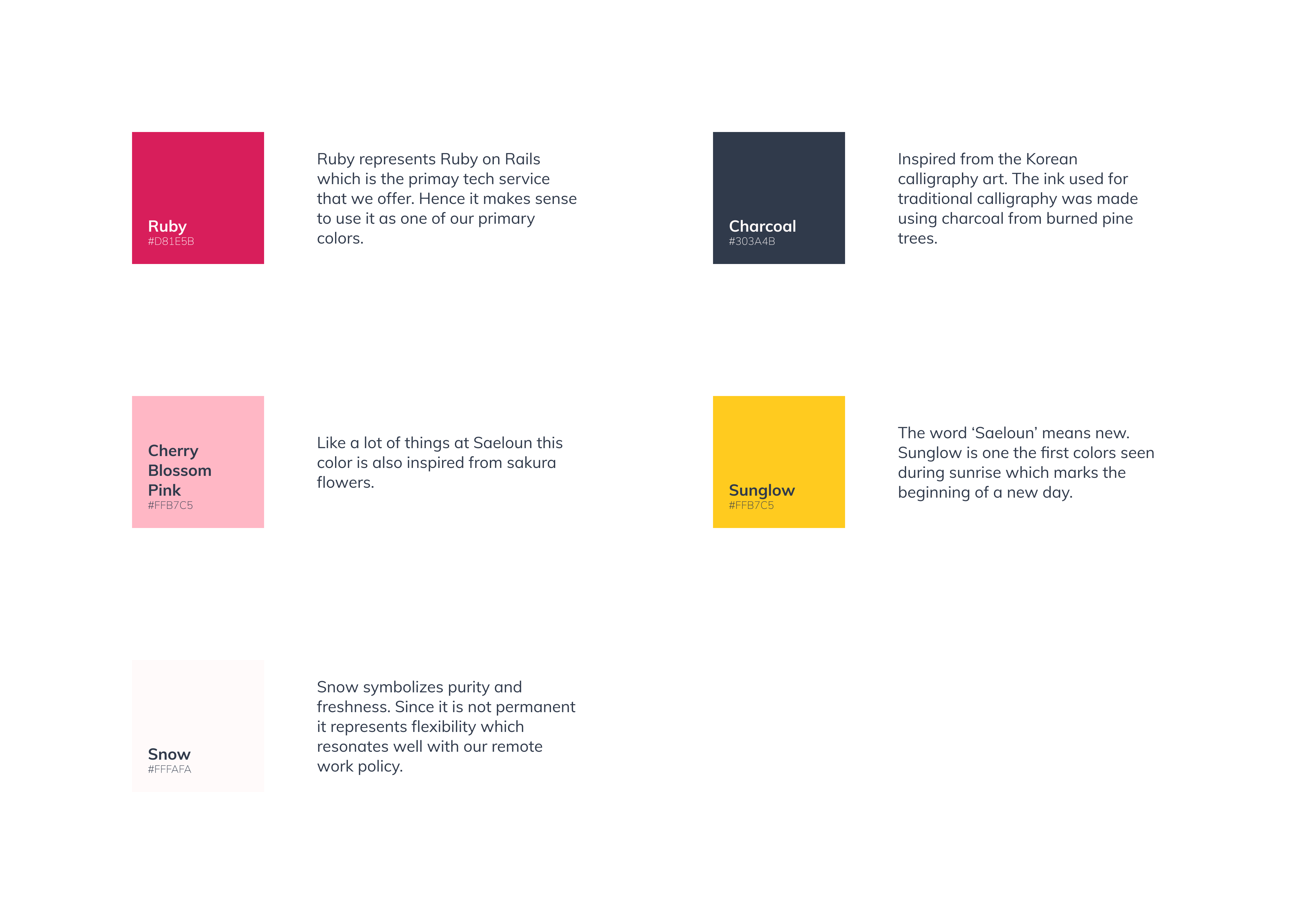
Now, we had a good set of color palettes to choose from. A lot of them were good and we had to decide which one to go ahead with. For this, we decided to tweak the autogenerated color palettes to our liking and also associate some meaning to them.
This is the final color palette which we decided to go ahead with:

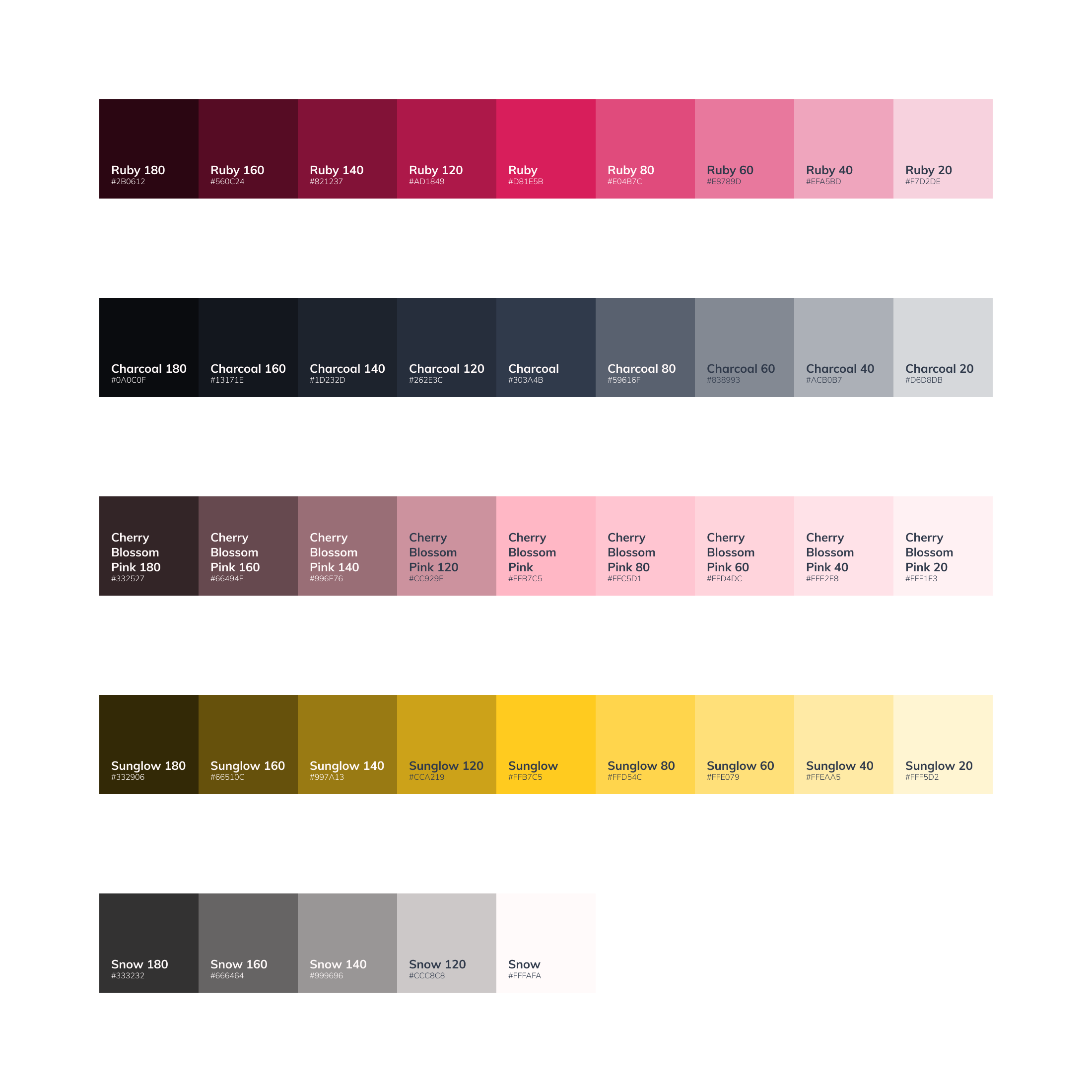
A more diverse set of colors
This is how the primary color palette was created. But this had only five colors which might not be sufficient for some applications. Therefore, we decided to create an extended palette and added 20, 40 & 60 & 80 percent black and white to each of the primary colors. This yielded us even a more diverse set of shades.

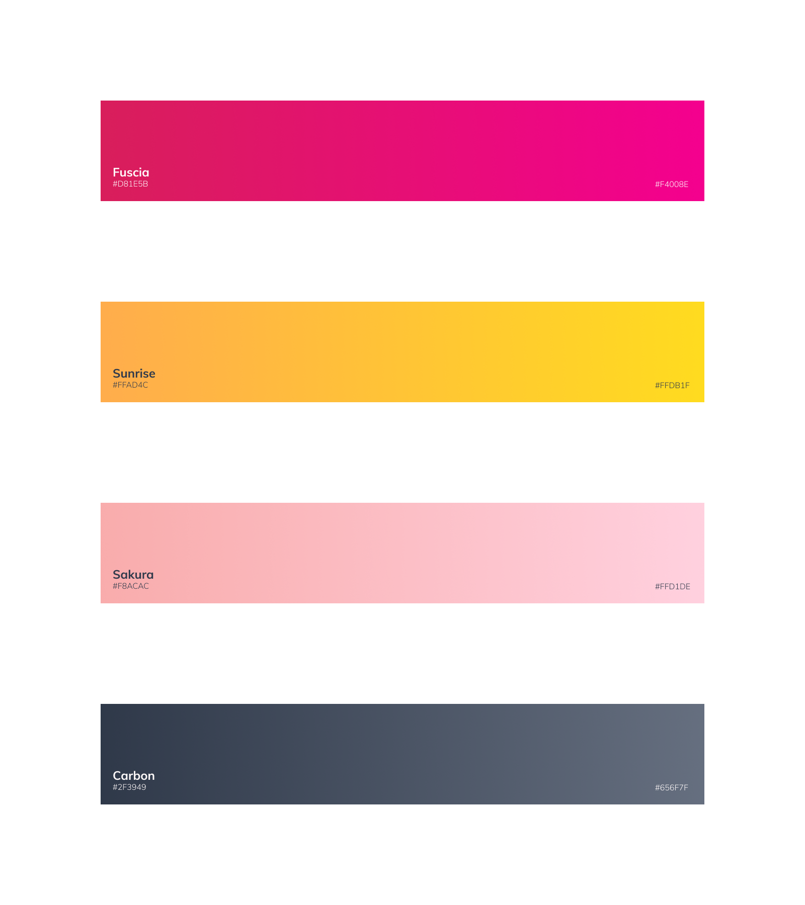
Gradients
Gradients are one of the hottest trends in graphic design recently. It is a great way to add dynamism to our brand touchpoints. So, we decided to use them subtly in certain aspects of our brand such as primary CTAs, to grab the user’s attention. This article talks about some reasons why gradients work and how to create the perfect gradients for your brand.

Look at the images above. These are the different color styles that we created for our brand. Continue reading to find out how we defined the typography for our brand. 📝
