Typography is one of the most important aspects of visual identity. It is the art, technique, and practice of arranging type to make written language legible, readable, and appealing when displayed. Clarity and organization is the most important aspect of typography. Like colors, picking a particular typeface for our brand is quite subjective. To define the typography for our brand, we explored various typefaces that resonated with our keywords from the brand sprint. We were looking for something that is not only bold and modern but also playful and elegant.
We considered the following factors while selecting a typeface for our brand-
Legibility
Legibility is the ease of reading symbols. It was the top parameter for choosing a typeface and we wanted to ensure all our text is easy to read for users of all ages.
Browser compatibility/Availability
Another important factor for the typeface is that it must be easily available for browsers to render. We didn’t want to load our website with heavy font files as it can affect the performance. As apart from the web, we also use our brand type for printable materials, we wanted to ensure that the font is easily available for download without copyright violations.
Number of font weights
We considered typefaces that have more than six weights. Using different font weights we can maintain visual hierarchy among the content, especially, in the case of a lot of text. This helps users to give a quick glance and scan through important elements before they decide to read in detail. This goes a long way in saving users’ precious time and helping them to get to the relevant content quicker. Read more about the user reading vs scanning behavior here.
Sans serif
Sans serif is a category of fonts whose characters do not have extending features (called serifs) at the end of strokes. Sans serif fonts generally look modern, as compared to other serif fonts. We were particularly looking at neo-grotesque fonts in the lines of some popular fonts like Helvetica and Roboto.
Primary typeface
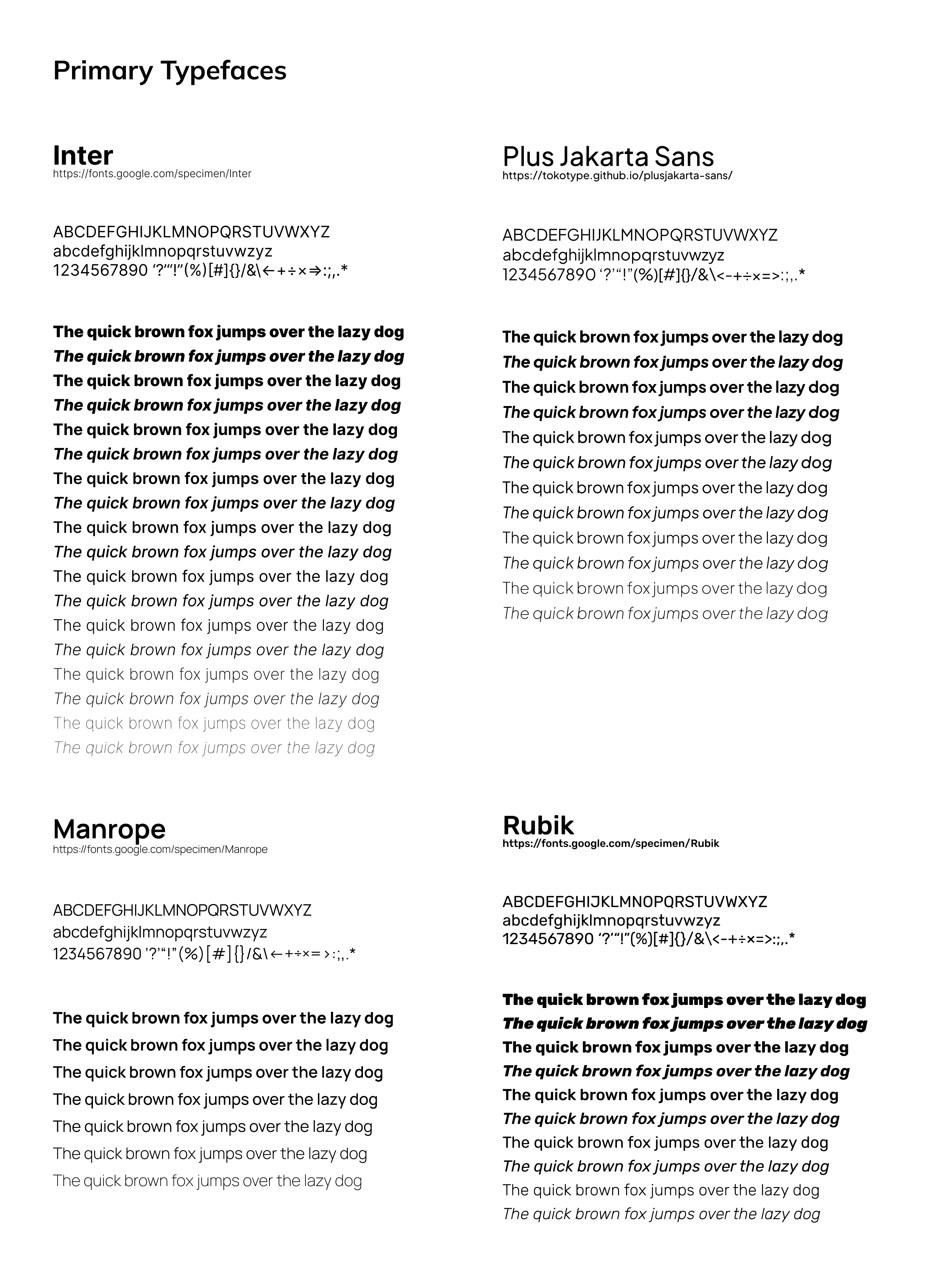
Based on the above parameters, we shortlisted four typefaces that seemed to be matching our requirements. Look at the image below. These are the primary typefaces we considered for our brand:

Finally, we decided to go with Plus Jakarta Sans as our brand font as this font was quite modern, legible, and both functionally and aesthetically suitable for our redesigned landing page. It is designed by a design studio called Tokotype Studio. It was originally designed for Jakarta City branding in 2020 as an open-source under the SIL Open Font License, Version 1.1. You can check it out at https://tokotype.github.io/plusjakarta-sans/.
Display typeface
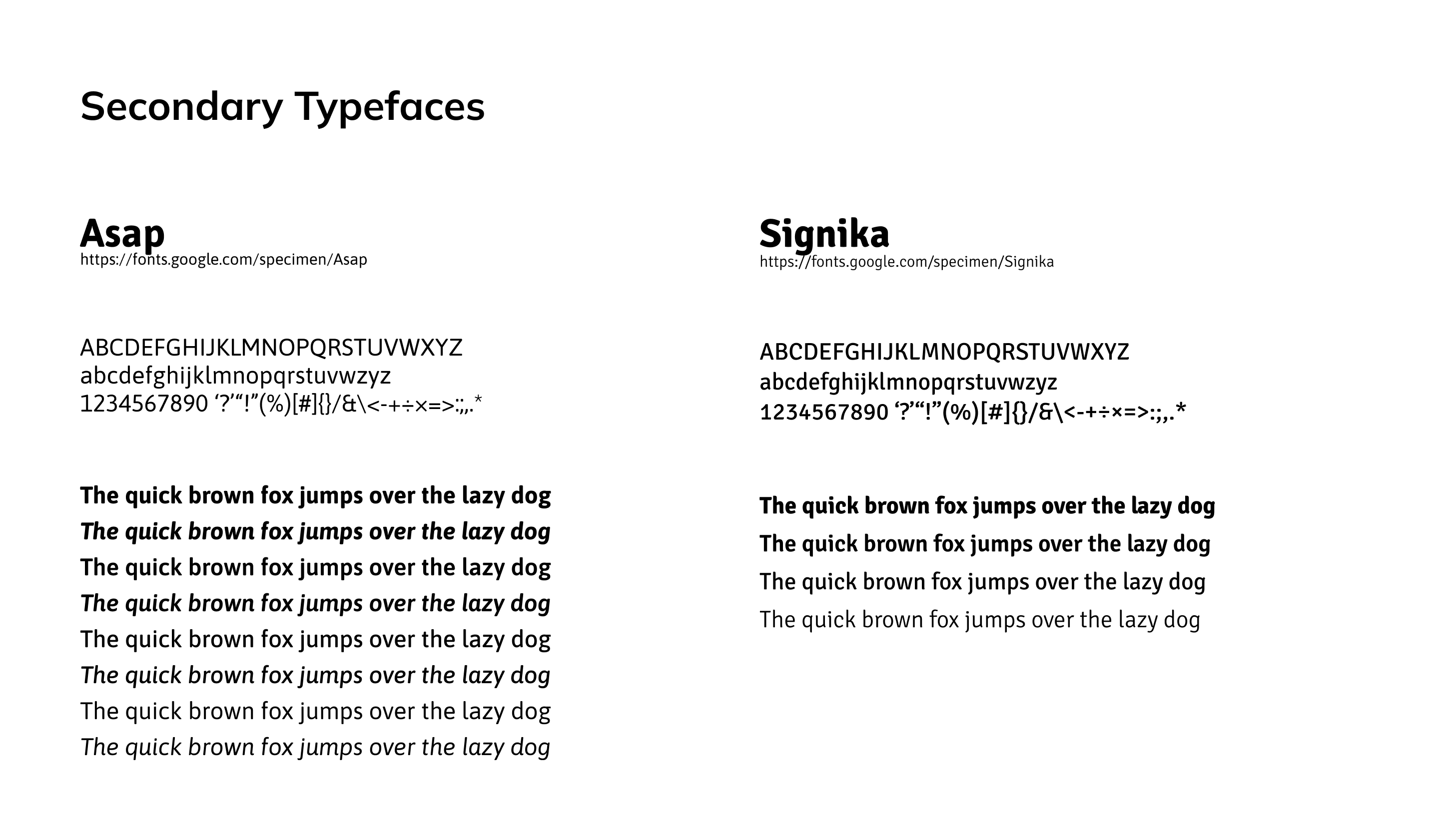
Apart from the primary typeface, we also looked at some display typefaces, intended to be paired with the primary. We explored some typefaces that are distinct and complement the primary typeface. It will be used sparingly at places where we want to give more emphasis. Display typefaces are relatively less legible and are only used for large texts with fewer words and not for long sentences or paragraphs. We were looking for round and less sharp features in the display typeface. Look at the image below. These are some of the display typefaces we chose for our brand:

Usage
Going forward, these typefaces would be used for our website, official documents (both digital and print), and other brand accessories such as ID cards, business cards, t-shirts, etc.
